Pre-Programme work

Task 1: Short biography written using markdown
Brief Biography
My name is Hanlu Lin. I was born in China, Fujian province, lying in the southeastern part of China. I studied in Fuzhou No.1 High school in Fuzhou, and then studied my bachelor degree in Hong Kong, majoring in Hotel Management and Finance.
Before I applied to London Business School for the MAM program, I have several internship experience as follows:
1. Business Analyst in Tencent
2. Strategic Consultant in Kantar Consulting
3. Analyst in Jones Lang LaSalle
From the internship experience, I decided to dig deeper into the business analytics fields. And I applied for the master degree in London Business School, which is a renowned business school with such beautiful campus located in London.I very much look forward to my study life there in London Business School for the coming years.
Task 2: gapminder country comparison
glimpse(gapminder)## Rows: 1,704
## Columns: 6
## $ country <fct> "Afghanistan", "Afghanistan", "Afghanistan", "Afghanistan", ~
## $ continent <fct> Asia, Asia, Asia, Asia, Asia, Asia, Asia, Asia, Asia, Asia, ~
## $ year <int> 1952, 1957, 1962, 1967, 1972, 1977, 1982, 1987, 1992, 1997, ~
## $ lifeExp <dbl> 28.801, 30.332, 31.997, 34.020, 36.088, 38.438, 39.854, 40.8~
## $ pop <int> 8425333, 9240934, 10267083, 11537966, 13079460, 14880372, 12~
## $ gdpPercap <dbl> 779.4453, 820.8530, 853.1007, 836.1971, 739.9811, 786.1134, ~head(gapminder, 20) # look at the first 20 rows of the dataframe## # A tibble: 20 x 6
## country continent year lifeExp pop gdpPercap
## <fct> <fct> <int> <dbl> <int> <dbl>
## 1 Afghanistan Asia 1952 28.8 8425333 779.
## 2 Afghanistan Asia 1957 30.3 9240934 821.
## 3 Afghanistan Asia 1962 32.0 10267083 853.
## 4 Afghanistan Asia 1967 34.0 11537966 836.
## 5 Afghanistan Asia 1972 36.1 13079460 740.
## 6 Afghanistan Asia 1977 38.4 14880372 786.
## 7 Afghanistan Asia 1982 39.9 12881816 978.
## 8 Afghanistan Asia 1987 40.8 13867957 852.
## 9 Afghanistan Asia 1992 41.7 16317921 649.
## 10 Afghanistan Asia 1997 41.8 22227415 635.
## 11 Afghanistan Asia 2002 42.1 25268405 727.
## 12 Afghanistan Asia 2007 43.8 31889923 975.
## 13 Albania Europe 1952 55.2 1282697 1601.
## 14 Albania Europe 1957 59.3 1476505 1942.
## 15 Albania Europe 1962 64.8 1728137 2313.
## 16 Albania Europe 1967 66.2 1984060 2760.
## 17 Albania Europe 1972 67.7 2263554 3313.
## 18 Albania Europe 1977 68.9 2509048 3533.
## 19 Albania Europe 1982 70.4 2780097 3631.
## 20 Albania Europe 1987 72 3075321 3739.country_data <- gapminder %>%
filter(country == "China")
continent_data <- gapminder %>%
filter(continent == "Asia")plot1 <- ggplot(data = country_data, mapping = aes(x = year, y = lifeExp))+
geom_point() +
geom_smooth(se = FALSE)+
NULL
plot1## `geom_smooth()` using method = 'loess' and formula 'y ~ x'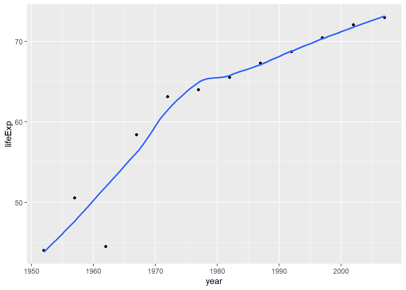
plot1<- plot1 +
  labs(title = "China's life expectancy over time",
      x = "Year",
      y = "Life Expectancy") +
  NULL


plot1
## `geom_smooth()` using method = 'loess' and formula 'y ~ x'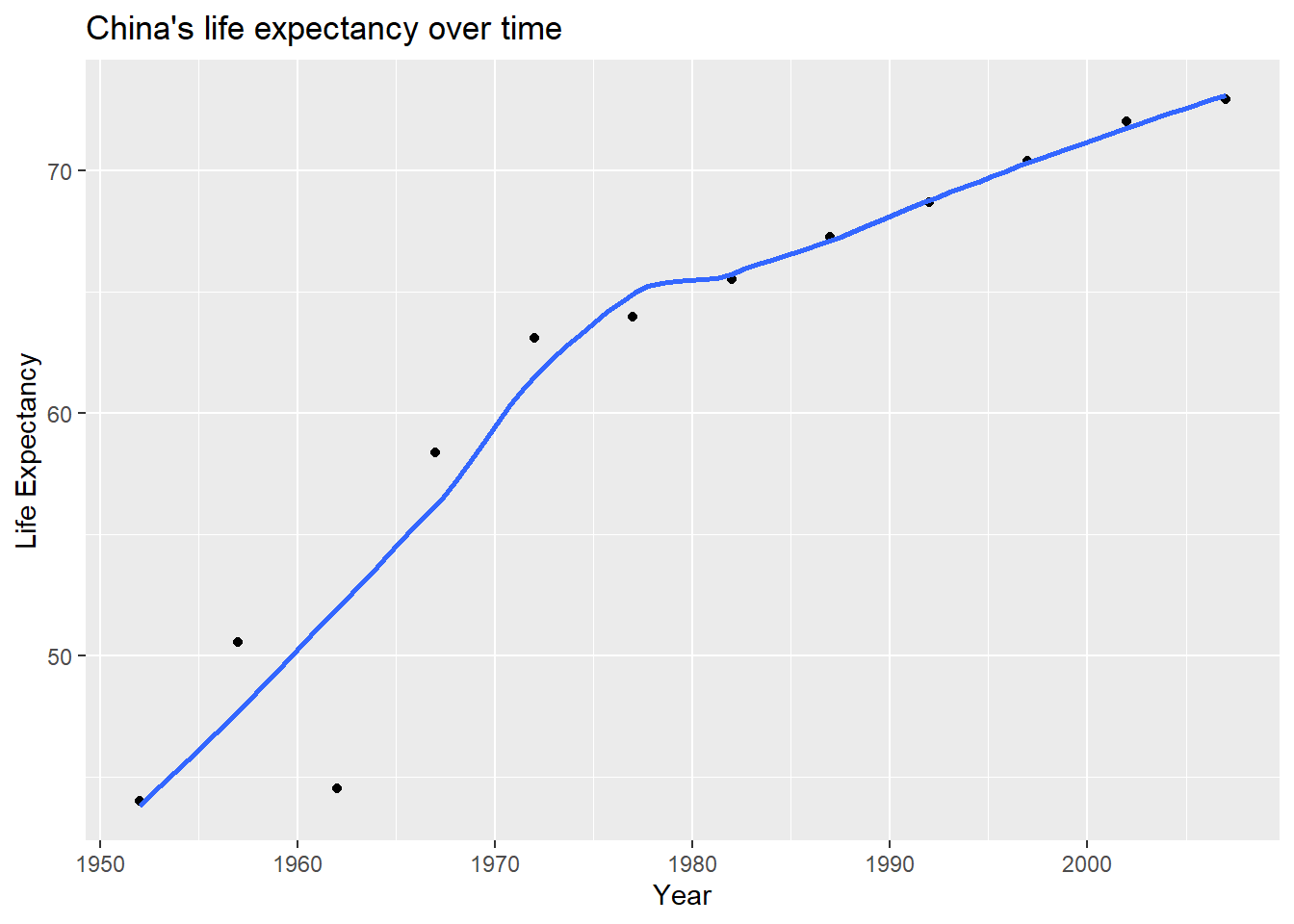
ggplot(continent_data, mapping = aes(x = year, y = lifeExp, colour= country, group = country))+
  geom_point() +
  geom_smooth(se = FALSE) +
  NULL
## `geom_smooth()` using method = 'loess' and formula 'y ~ x'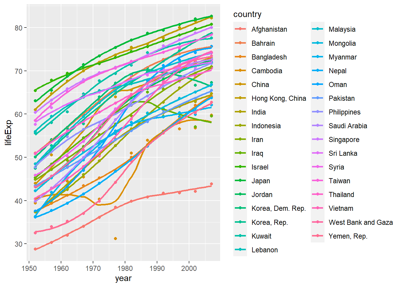
ggplot(data = gapminder , mapping = aes(x = year, y = lifeExp,colour = continent))+
  geom_point() +
  geom_smooth(se = FALSE) +
  facet_wrap(~continent) +
  theme(legend.position="none") + #remove all legends
  NULL
## `geom_smooth()` using method = 'loess' and formula 'y ~ x'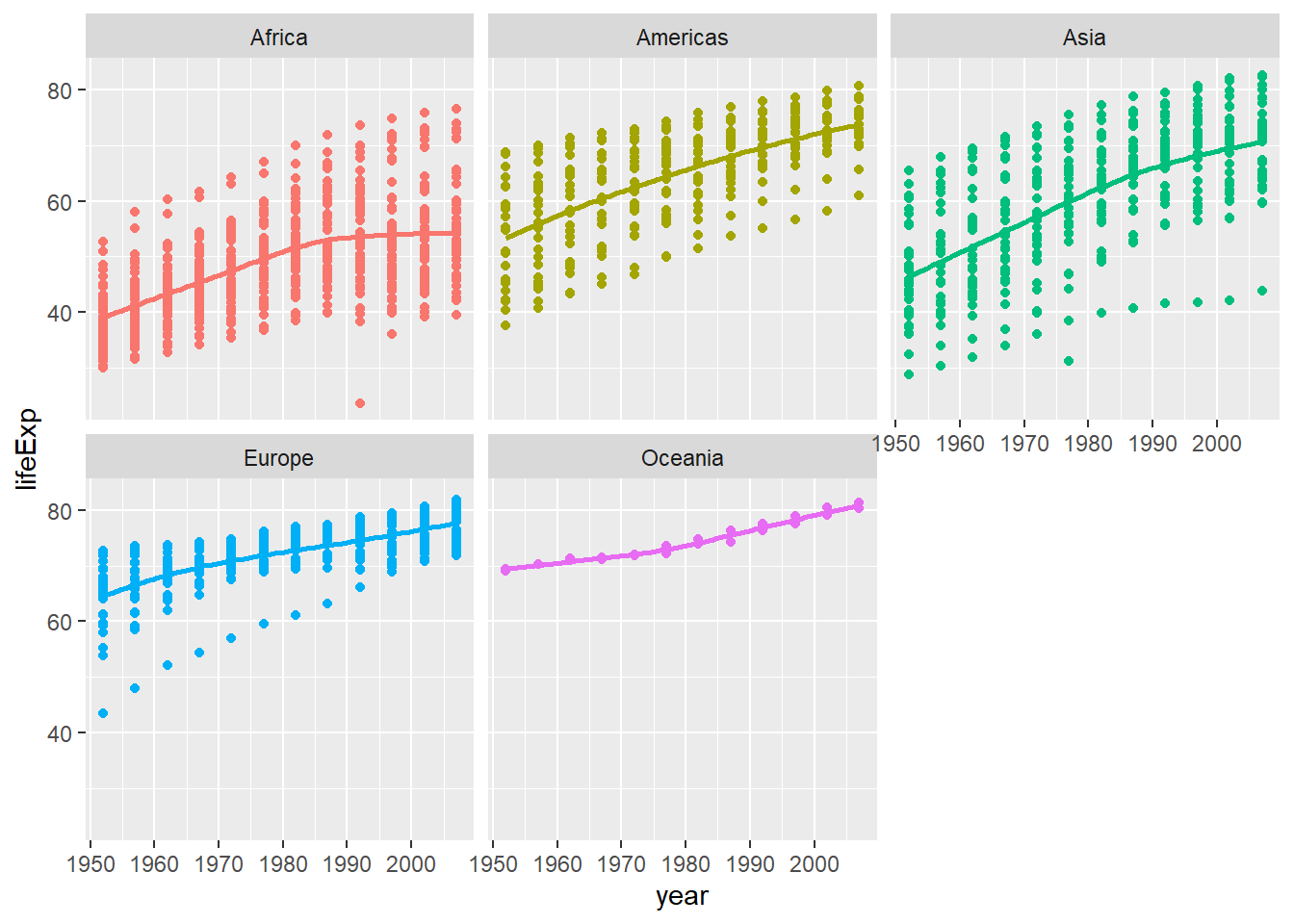
Type your answer after this blockquote.
Given these trends, we can find that most of the countries in Asia, including China, have a stable increase of life expectancy since 1952. And there shows a slowdown in the growth of life expectancy in Asian countries from 1980. Among all continents, all of the 5 continents shows growth in life expectancy over years from 1951. The growth rate of life expectancy in Asia is higher than that in continents like Afria, Europe and Oceania. So that we can tell that the development of economics,culture and medical treatement in those develeoping countries in Asia since 1952 is in a more rapid pace, comparing to those developed countries in Europe.
Task 3: Brexit vote analysis
brexit_results <- read_csv(here::here("brexit_results.csv"))


glimpse(brexit_results)
## Rows: 632
## Columns: 11
## $ Seat <chr> "Aldershot", "Aldridge-Brownhills", "Altrincham and Sale W~
## $ con_2015 <dbl> 50.592, 52.050, 52.994, 43.979, 60.788, 22.418, 52.454, 22~
## $ lab_2015 <dbl> 18.333, 22.369, 26.686, 34.781, 11.197, 41.022, 18.441, 49~
## $ ld_2015 <dbl> 8.824, 3.367, 8.383, 2.975, 7.192, 14.828, 5.984, 2.423, 1~
## $ ukip_2015 <dbl> 17.867, 19.624, 8.011, 15.887, 14.438, 21.409, 18.821, 21.~
## $ leave_share <dbl> 57.89777, 67.79635, 38.58780, 65.29912, 49.70111, 70.47289~
## $ born_in_uk <dbl> 83.10464, 96.12207, 90.48566, 97.30437, 93.33793, 96.96214~
## $ male <dbl> 49.89896, 48.92951, 48.90621, 49.21657, 48.00189, 49.17185~
## $ unemployed <dbl> 3.637000, 4.553607, 3.039963, 4.261173, 2.468100, 4.742731~
## $ degree <dbl> 13.870661, 9.974114, 28.600135, 9.336294, 18.775591, 6.085~
## $ age_18to24 <dbl> 9.406093, 7.325850, 6.437453, 7.747801, 5.734730, 8.209863~# histogram
ggplot(brexit_results, aes(x = leave_share)) +
geom_histogram(binwidth = 2.5)+
labs(title = "Distribution of constituencies' leave share",
x = "Leave Share",
y = "Count")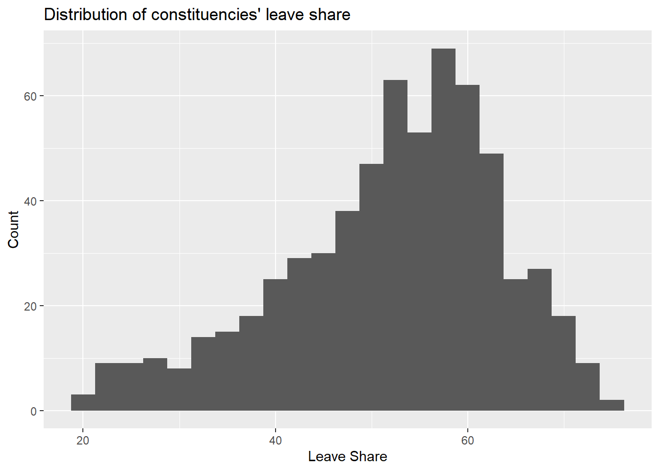
# density plot-- think smoothed histogram
ggplot(brexit_results, aes(x = leave_share)) +
  geom_density()+
  labs(title = "Density of constituencies' leave share",
      x = "Leave Share",
      y = "Density")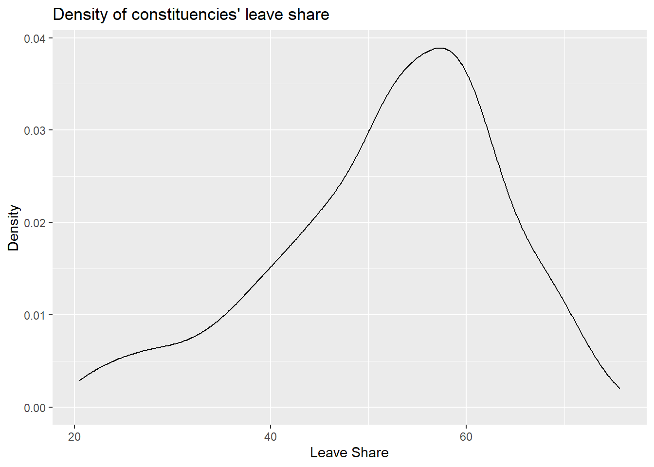
# The empirical cumulative distribution function (ECDF)
ggplot(brexit_results, aes(x = leave_share)) +
  stat_ecdf(geom = "step", pad = FALSE) +
  scale_y_continuous(labels = scales::percent)+
  labs(title = "Empirical cumulative distribution of constituencies' leave share",
      x = "Leave Share",
      y = "Cumulative distribution")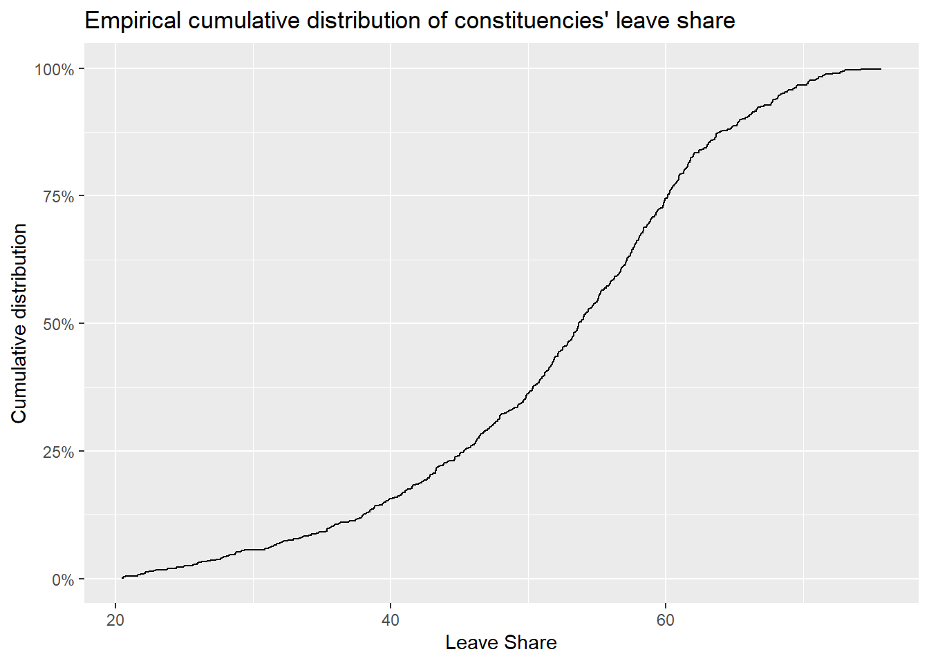
brexit_results %>%
  select(leave_share, born_in_uk) %>%
  cor()
## leave_share born_in_uk
## leave_share 1.0000000 0.4934295
## born_in_uk 0.4934295 1.0000000ggplot(brexit_results, aes(x = born_in_uk, y = leave_share)) +
geom_point(alpha=0.3) +
# add a smoothing line, and use method="lm" to get the best straight-line
geom_smooth(method = "lm") +
# use a white background and frame the plot with a black box
theme_bw() +
labs(title = "Correlation between the proportion of native born residents in a constituency and its leave share",
x = "Proportion of native born residents",
y = "Leave Share")+
NULL## `geom_smooth()` using formula 'y ~ x'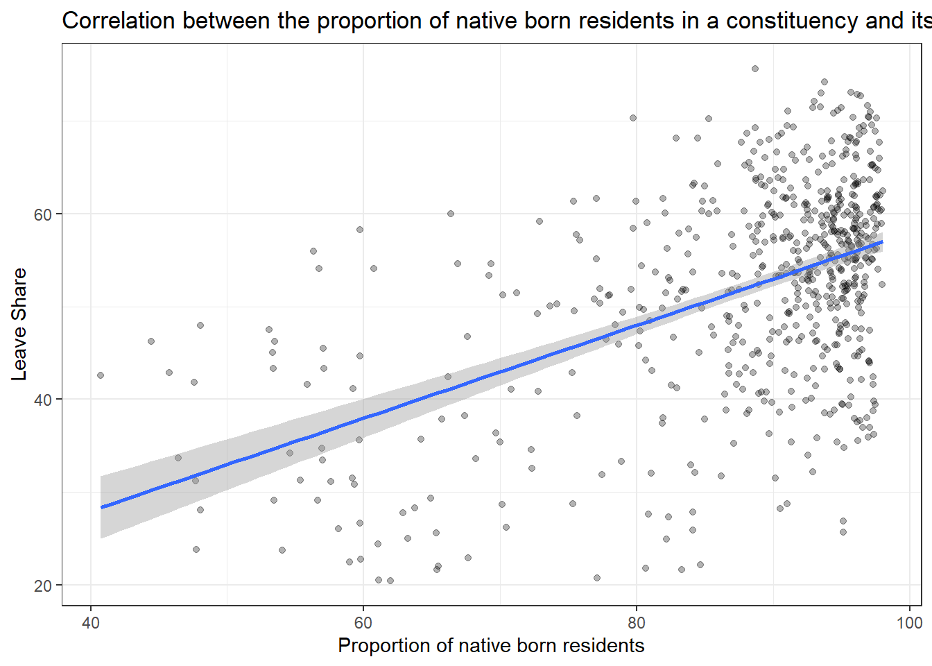
Type your answer after, and outside, this blockquote.
My analysis shows that the proportion of native born residents in a constituency and its leave share are positively correlated. With more proportion of native born residents in the constituency, the leave share of the constituency is higher, which is to say, in those constituencies that containing more natives, people are more tend to support the Brexit, with the fear of immigration and opposition to the EU’s more open border policy.
Task 4: Animal rescue incidents attended by the London Fire Brigade
url <- "https://data.london.gov.uk/download/animal-rescue-incidents-attended-by-lfb/8a7d91c2-9aec-4bde-937a-3998f4717cd8/Animal%20Rescue%20incidents%20attended%20by%20LFB%20from%20Jan%202009.csv"

animal_rescue <- read_csv(url,
                          locale = locale(encoding = "CP1252")) %>%
  janitor::clean_names()


glimpse(animal_rescue)
## Rows: 7,772
## Columns: 31
## $ incident_number <dbl> 139091, 275091, 2075091, 2872091, 355309~
## $ date_time_of_call <chr> "01/01/2009 03:01", "01/01/2009 08:51", ~
## $ cal_year <dbl> 2009, 2009, 2009, 2009, 2009, 2009, 2009~
## $ fin_year <chr> "2008/09", "2008/09", "2008/09", "2008/0~
## $ type_of_incident <chr> "Special Service", "Special Service", "S~
## $ pump_count <chr> "1", "1", "1", "1", "1", "1", "1", "1", ~
## $ pump_hours_total <chr> "2", "1", "1", "1", "1", "1", "1", "1", ~
## $ hourly_notional_cost <dbl> 255, 255, 255, 255, 255, 255, 255, 255, ~
## $ incident_notional_cost <chr> "510", "255", "255", "255", "255", "255"~
## $ final_description <chr> "Redacted", "Redacted", "Redacted", "Red~
## $ animal_group_parent <chr> "Dog", "Fox", "Dog", "Horse", "Rabbit", ~
## $ originof_call <chr> "Person (land line)", "Person (land line~
## $ property_type <chr> "House - single occupancy", "Railings", ~
## $ property_category <chr> "Dwelling", "Outdoor Structure", "Outdoo~
## $ special_service_type_category <chr> "Other animal assistance", "Other animal~
## $ special_service_type <chr> "Animal assistance involving livestock -~
## $ ward_code <chr> "E05011467", "E05000169", "E05000558", "~
## $ ward <chr> "Crystal Palace & Upper Norwood", "Woods~
## $ borough_code <chr> "E09000008", "E09000008", "E09000029", "~
## $ borough <chr> "Croydon", "Croydon", "Sutton", "Hilling~
## $ stn_ground_name <chr> "Norbury", "Woodside", "Wallington", "Ru~
## $ uprn <chr> "NULL", "NULL", "NULL", "100021491149", ~
## $ street <chr> "Waddington Way", "Grasmere Road", "Mill~
## $ usrn <chr> "20500146", "NULL", "NULL", "21401484", ~
## $ postcode_district <chr> "SE19", "SE25", "SM5", "UB9", "RM3", "RM~
## $ easting_m <chr> "NULL", "534785", "528041", "504689", "N~
## $ northing_m <chr> "NULL", "167546", "164923", "190685", "N~
## $ easting_rounded <dbl> 532350, 534750, 528050, 504650, 554650, ~
## $ northing_rounded <dbl> 170050, 167550, 164950, 190650, 192350, ~
## $ latitude <chr> "NULL", "51.39095371", "51.36894086", "5~
## $ longitude <chr> "NULL", "-0.064166887", "-0.161985191", ~animal_rescue %>%
dplyr::group_by(cal_year) %>%
summarise(count=n())## # A tibble: 13 x 2
## cal_year count
## <dbl> <int>
## 1 2009 568
## 2 2010 611
## 3 2011 620
## 4 2012 603
## 5 2013 585
## 6 2014 583
## 7 2015 540
## 8 2016 604
## 9 2017 539
## 10 2018 610
## 11 2019 604
## 12 2020 758
## 13 2021 547animal_rescue %>%
count(cal_year, name="count")## # A tibble: 13 x 2
## cal_year count
## <dbl> <int>
## 1 2009 568
## 2 2010 611
## 3 2011 620
## 4 2012 603
## 5 2013 585
## 6 2014 583
## 7 2015 540
## 8 2016 604
## 9 2017 539
## 10 2018 610
## 11 2019 604
## 12 2020 758
## 13 2021 547animal_rescue %>%
group_by(animal_group_parent) %>%
#group_by and summarise will produce a new column with the count in each animal group
summarise(count = n()) %>%
# mutate adds a new column; here we calculate the percentage
mutate(percent = round(100*count/sum(count),2)) %>%
# arrange() sorts the data by percent. Since the default sorting is min to max and we would like to see it sorted
# in descending order (max to min), we use arrange(desc())
arrange(desc(percent))## # A tibble: 28 x 3
## animal_group_parent count percent
## <chr> <int> <dbl>
## 1 Cat 3736 48.1
## 2 Bird 1611 20.7
## 3 Dog 1213 15.6
## 4 Fox 366 4.71
## 5 Unknown - Domestic Animal Or Pet 199 2.56
## 6 Horse 195 2.51
## 7 Deer 132 1.7
## 8 Unknown - Wild Animal 93 1.2
## 9 Squirrel 66 0.85
## 10 Unknown - Heavy Livestock Animal 50 0.64
## # ... with 18 more rowsanimal_rescue %>%
#count does the same thing as group_by and summarise
# name = "count" will call the column with the counts "count" ( exciting, I know)
# and 'sort=TRUE' will sort them from max to min
count(animal_group_parent, name="count", sort=TRUE) %>%
mutate(percent = round(100*count/sum(count),2))## # A tibble: 28 x 3
## animal_group_parent count percent
## <chr> <int> <dbl>
## 1 Cat 3736 48.1
## 2 Bird 1611 20.7
## 3 Dog 1213 15.6
## 4 Fox 366 4.71
## 5 Unknown - Domestic Animal Or Pet 199 2.56
## 6 Horse 195 2.51
## 7 Deer 132 1.7
## 8 Unknown - Wild Animal 93 1.2
## 9 Squirrel 66 0.85
## 10 Unknown - Heavy Livestock Animal 50 0.64
## # ... with 18 more rowsPlease note that any cost included is a notional cost calculated based on the length of time rounded up to the nearest hour spent by Pump, Aerial and FRU appliances at the incident and charged at the current Brigade hourly rate.
# what type is variable incident_notional_cost from dataframe `animal_rescue`
typeof(animal_rescue$incident_notional_cost)
## [1] "character"# readr::parse_number() will convert any numerical values stored as characters into numbers
animal_rescue <- animal_rescue %>%
# we use mutate() to use the parse_number() function and overwrite the same variable
mutate(incident_notional_cost = parse_number(incident_notional_cost))
# incident_notional_cost from dataframe `animal_rescue` is now 'double' or numeric
typeof(animal_rescue$incident_notional_cost)## [1] "double"animal_rescue %>%
# group by animal_group_parent
group_by(animal_group_parent) %>%
# filter resulting data, so each group has at least 6 observations
filter(n()>6) %>%
# summarise() will collapse all values into 3 values: the mean, median, and count
# we use na.rm=TRUE to make sure we remove any NAs, or cases where we do not have the incident cos
summarise(mean_incident_cost = mean (incident_notional_cost, na.rm=TRUE),
median_incident_cost = median (incident_notional_cost, na.rm=TRUE),
sd_incident_cost = sd (incident_notional_cost, na.rm=TRUE),
min_incident_cost = min (incident_notional_cost, na.rm=TRUE),
max_incident_cost = max (incident_notional_cost, na.rm=TRUE),
count = n()) %>%
# sort the resulting data in descending order. You choose whether to sort by count or mean cost.
arrange(desc(mean_incident_cost))## # A tibble: 16 x 7
## animal_group_parent mean_incident_co~ median_incident_~ sd_incident_cost
## <chr> <dbl> <dbl> <dbl>
## 1 Horse 740. 596 541.
## 2 Cow 634. 520 475.
## 3 Deer 417. 333 286.
## 4 Unknown - Wild Animal 416. 333 324.
## 5 Unknown - Heavy Livesto~ 374. 260 263.
## 6 Fox 373. 328 206.
## 7 Snake 356. 339 105.
## 8 Dog 347. 298 169.
## 9 Bird 344. 328 135.
## 10 Cat 343. 298 160.
## 11 Unknown - Domestic Anim~ 326. 295 117.
## 12 cat 324. 290 94.1
## 13 Hamster 315. 290 95.0
## 14 Squirrel 313. 326 57.1
## 15 Ferret 309. 333 39.4
## 16 Rabbit 309. 326 32.2
## # ... with 3 more variables: min_incident_cost <dbl>, max_incident_cost <dbl>,
## # count <int>From the comparison of the mean and median of each group, we can see that the incident cost for Horse is relatively higher than other animal groups. The cost for cat is relatively lower instead.
Among all the animal groups, we found an outlier in dogs group with the minimum incident cost of 0, which lowers down the mean incident cost for the dog group.
# base_plot
base_plot <- animal_rescue %>%
  group_by(animal_group_parent) %>%
  filter(n()>6) %>%
  ggplot(aes(x=incident_notional_cost))+
  facet_wrap(~animal_group_parent, scales = "free")+
  theme_bw()

base_plot + geom_histogram()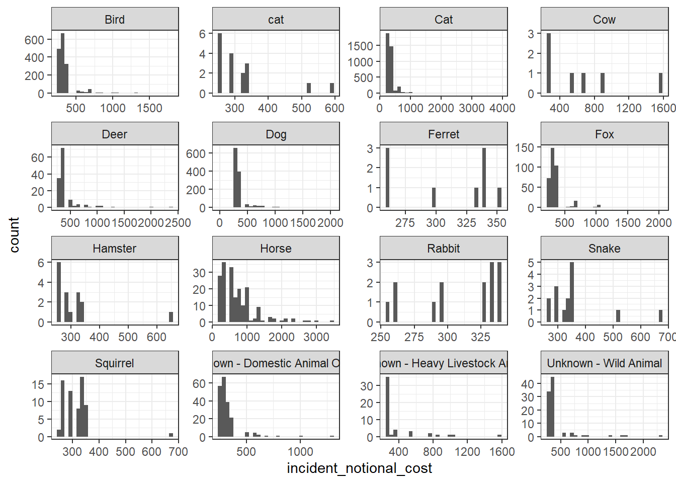
base_plot + geom_density()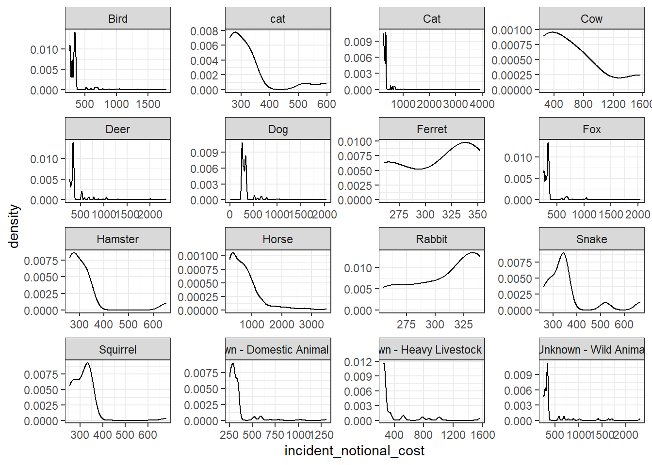
base_plot + geom_boxplot()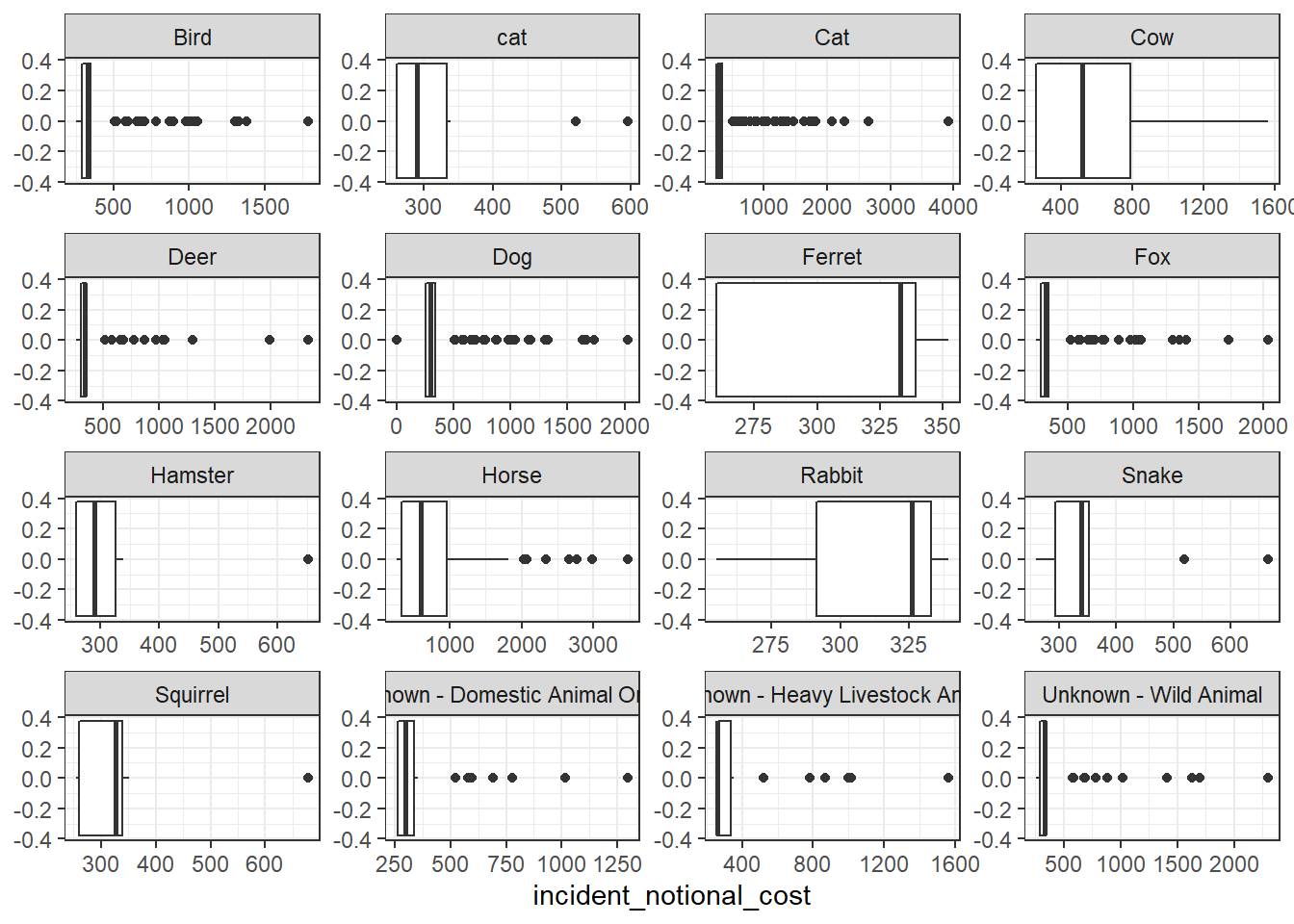
base_plot + stat_ecdf(geom = "step", pad = FALSE) +
  scale_y_continuous(labels = scales::percent)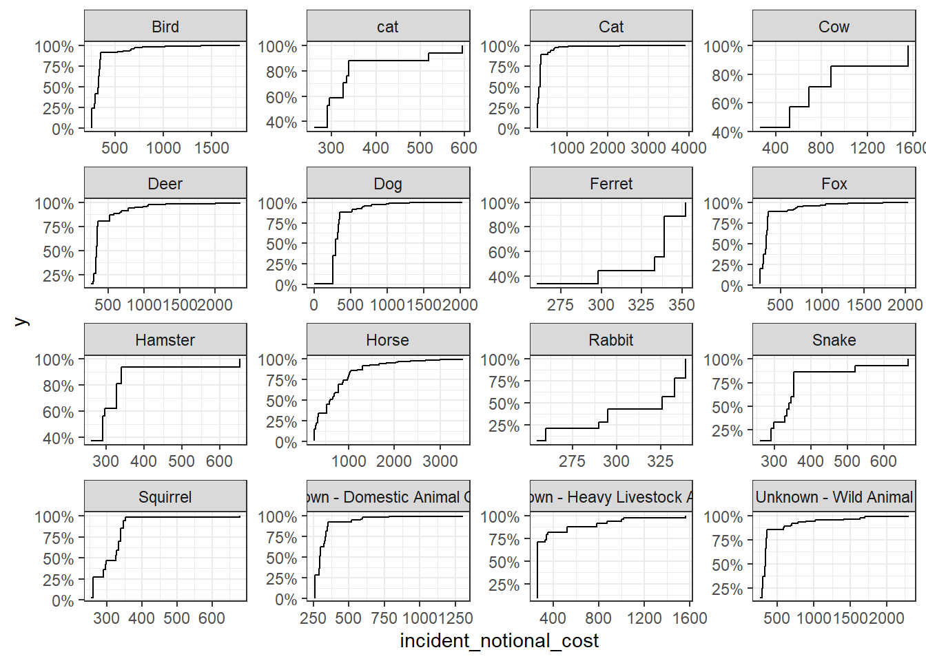
I think the distribution histogram best communicates the variability of the incident_notional_cost values, as we can see clearly how it distributes from the graph.
From the graph, we can tell that horses are more expensive to rescue than other animals. The cost of most cases of horses is around 1000, and some of the cases indicates costs around 2000-3000. While other animals like rabbit, hamster, squirrel, ferret, and cat, the incident cost of these animal groups are more centered in the range of 200-400, which is relatively lower. These animals are cheaper to rescue instead.